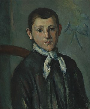
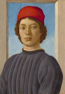
The first Self Portrait chosen:
 |
| Louis Guillaume Paul Cezanne 1882 22" x 18" 3/8 oil on canvas |
| Rubens Peale With a Geranium Rembrandt Peale 1801 28.1" x 24" oil on canvas |
 |
| Portrait of a Youth Fillippino Lippi 1485 20" 1/2 x 14" 3/8 Oil and tempura on panel |
1.) I selected these three inspiration pieces because they are all different, but unique in their own way. The first one does not look as realistic as the other two, but I really liked the dark colors used. The second one, I found funny. It was odd to me that he was holding a plant but I still really liked how it turned out. The colors of the plant really accent the dull, brown colors used on him. The third painting, however, contains many solid colors which stuck out to me. It is a very realistic painting. All three of the portraits do not have smiles on their faces, which is why I chose not to smile.
2.) I chose to use pencil on paper because this is the media I know how to draw with best. I did not want this project to be too much of a challenge because the end of the semester is going fast and I am already turning this project in later than I should have. I wish I would have taken the time to experience with something new, but I think it is okay because I have already gone out of my usual comfort zone a few times with this class, like the mask making.
3.) The most difficult challenges I faced while completing this project was trying to find a virtual art gallery online that I enjoyed and then drawing my hair. I never knew how difficult it would be to draw simple hair. I really like the art that was at the Washington DC art gallery, so after about 30 minutes of looking, I chose that one. And as you can see, I would say that I did not directly overcome the challenge with my hair. It looks pretty bad, but I did the best I could.
4.) In my opinion, this piece does not really represent me. My best feature I would say is my eyes and I did not do a very good job on them, but that is my artistic abilities to blame. I would say that I did a good job on the outline/structure of my face, I also did good with the shading in my opinion. I feel like this is a project that would look better with tons and tons of practice, something I simply do not have.
5.) I tried to use the elements of value and line for this project. I tried my best to do the shading so it would look like black, gray and white were used. I used line for my hair, face structure, and nose mostly. I also wanted to make this self portrait as symmetrical as possible, I think I did a good job. It looks pretty even.
6.) I did enjoy working on this project for the most part. I got frustrated at times when trying to draw the hair and lips, but it was nothing too serious. This art project was something I have never done before but I thought it was fun. The advice that I would give myself for next time would be to take my time, focus on details (especially in the eyes), and just have fun with it.
7.) My final piece is mediocre at best. I really like the way my face structure, nose, and shading turned out but the rest is not my favorite. I wish I knew more techniques that would have worked to help create the hair but once again, nothing too serious. It is not my best artwork but I would say that I did the best I could and i'm happy with it.


No comments:
Post a Comment