1.) I would say that my expectations of this course were met. Although, I did not expect this course to have much homework. I expected to learn so much about art because I barely knew anything before, and I am grateful to say that I have learned a lot. I know a lot about the elements and principles, the many categories art can be classified as, famous artists, and plenty more.
2.) The definition of art is going to be different from everybody you ask. Art is truly anything. Like I said in week one, art is the great form of expression and I still believe that after learning so much. Art takes skill and creativity and is truly the expression of feelings and emotion. At can be expressed through paintings, drawings, sculpting, molding, building's, architecture, etc. It is all about the creativeness and what people or the audience perceive it as.
3.) In the beginning of the semester, I selected Picasso to be my favorite artist. But, since I have completed the Art Curator project, Edwin Henry Landseer is now my new favorite. The way he expressed so much emotions in his paintings of dogs and animals, it really made me feel emotional. I loved almost all of his paintings and the stories he would represent. His paintings showed incredible detail and held tons of emotion within them.
4.) This was my first online course. Although, this course was difficult and challenging at times, I did enjoy it. This course saved me from having to go to school everyday out of the week and I was able to handle the stress of it, even with my job and the other four course I have taken. I have truly learned so much about art and its several meanings. The question I asked in my first post was, who determines the popularity of art? I still haven't gotten the answer. This is because, simply, there is no answer. I also wanted to learn about which art was most popular in certain time periods and I for sure know this now. Throughout the readings and watching the videos, I have learned all I wanted to know.
Thank you for such a fun experience with art and all of the crazy projects I had to complete. My favorite projects were the mask making and the art curator project, I enjoyed completing both of them.
Wednesday, May 15, 2019
Tuesday, May 14, 2019
Module 15 Self Portrait
National Gallery of Art, Washington DC was the art gallery that I visited virtually. I found this art gallery the most interesting out of all of the rest.
The first Self Portrait chosen:
Second self portrait chosen:
Third self portrait chosen:
The picture I took for my self portrait: The self portrait I drew:


The first Self Portrait chosen:
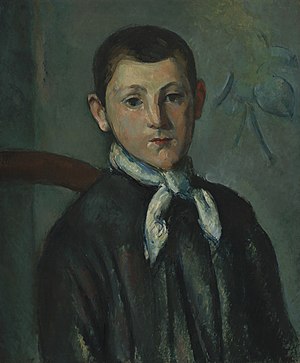 |
| Louis Guillaume Paul Cezanne 1882 22" x 18" 3/8 oil on canvas |
 |
| Rubens Peale With a Geranium Rembrandt Peale 1801 28.1" x 24" oil on canvas |
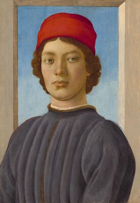 |
| Portrait of a Youth Fillippino Lippi 1485 20" 1/2 x 14" 3/8 Oil and tempura on panel |


1.) I selected these three inspiration pieces because they are all different, but unique in their own way. The first one does not look as realistic as the other two, but I really liked the dark colors used. The second one, I found funny. It was odd to me that he was holding a plant but I still really liked how it turned out. The colors of the plant really accent the dull, brown colors used on him. The third painting, however, contains many solid colors which stuck out to me. It is a very realistic painting. All three of the portraits do not have smiles on their faces, which is why I chose not to smile.
2.) I chose to use pencil on paper because this is the media I know how to draw with best. I did not want this project to be too much of a challenge because the end of the semester is going fast and I am already turning this project in later than I should have. I wish I would have taken the time to experience with something new, but I think it is okay because I have already gone out of my usual comfort zone a few times with this class, like the mask making.
3.) The most difficult challenges I faced while completing this project was trying to find a virtual art gallery online that I enjoyed and then drawing my hair. I never knew how difficult it would be to draw simple hair. I really like the art that was at the Washington DC art gallery, so after about 30 minutes of looking, I chose that one. And as you can see, I would say that I did not directly overcome the challenge with my hair. It looks pretty bad, but I did the best I could.
4.) In my opinion, this piece does not really represent me. My best feature I would say is my eyes and I did not do a very good job on them, but that is my artistic abilities to blame. I would say that I did a good job on the outline/structure of my face, I also did good with the shading in my opinion. I feel like this is a project that would look better with tons and tons of practice, something I simply do not have.
5.) I tried to use the elements of value and line for this project. I tried my best to do the shading so it would look like black, gray and white were used. I used line for my hair, face structure, and nose mostly. I also wanted to make this self portrait as symmetrical as possible, I think I did a good job. It looks pretty even.
6.) I did enjoy working on this project for the most part. I got frustrated at times when trying to draw the hair and lips, but it was nothing too serious. This art project was something I have never done before but I thought it was fun. The advice that I would give myself for next time would be to take my time, focus on details (especially in the eyes), and just have fun with it.
7.) My final piece is mediocre at best. I really like the way my face structure, nose, and shading turned out but the rest is not my favorite. I wish I knew more techniques that would have worked to help create the hair but once again, nothing too serious. It is not my best artwork but I would say that I did the best I could and i'm happy with it.
Wednesday, May 8, 2019
Module 13 and 14 video review
Key Concepts Learned:
The Lowdown on Lowbrow: West Coast Pop Art:
- This is art that know one knows how to categorize. It is a reaction against Highbrow culture. Also meaning, uncultivated and lack of taste. Very graphic art. This type of artwork gets to the point. It is all inclusive, does not let anybody out. This type of art boomed after World War II. It was very constant in portraying families, building nuke shelters, surfing, movies, etc. Basically anything could have been used as an idea for this type of art. Robert Williams was mentioned frequently in this video. Big Daddy Roth was another big contribute to Lowbrow art. Someone I have never heard of before. A lot of the art portrayed different comics and comic books, but with a twist. During this time period, drug use was at an all time high. Drugs were very common in this art as well. This art is very narrative, all art has a story and that story wanted to be told. Lots of people mentioned how this art was full of humor, dark humor. Tiki culture and Disneyland were also mentioned quite frequently. Lowbrow art has never had its own museum or anything, this shows that people do not find it important and think of this art as a joke. The good thing about this art though, it included women.
BBC Culture show: Tate Modern is 10:
- This is story teller art, it tells a different story every-time to different people. It gets re-arranged all of the time and art is added frequently. This art opens your eyes to structure. It was for sure different. From my point a view, some of this art just looks like a big mess of colors and shapes. I do not see a story or meaning to some of these paintings. But, paintings mean different things to different people. Some of this art was very simple, in my opinion, kind of boring and no point or story behind it.
An Acquiring Mind: Philippe de Montebello and Metropolitan Museum of Art:
- The art chosen for museums is picked very precisely. This museum has a goal to represent all cultures and eras. It is very hard to get the directed interested in art for the Metropolitan. It was really cool seeing a lot of the art that is showcased at this museum. Like the director wants, there is a lot of different cultures portrayed. All curators of this museum are very careful with their decisions. It was very interesting to learn how the art is made and kept in good condition. Then framed, presented and shown in the museum.
Video relation to my art project:
The Lowdown on Lowbrow: West Coast Pop Art:
- None of the artwork that I have chosen was considered Lowbrow art in my opinion. I wanted to keep my project classy and respectable.
BBC Culture show: Tate Modern is 10:
- This art did not really correlate to my project, besides the use of color. I tried to use some colorful paintings in my project to make it more fun and aesthetic.
An Acquiring Mind: Philippe de Montebello and Metropolitan Museum of Art:
The Lowdown on Lowbrow: West Coast Pop Art:
- I have never heard of the term Lowbrow art. From what I have learned it is very different. Lowbrow art reminds me of graffiti, freedom of expression. The examples of lowbrow art shown in this video were very graphic, sometimes vulgar. The colors used in this art was incredible, very cool to look at. On the other hand, this video could have been more informative, it was mostly made up of opinions. There were a lot of people/artists that talked about this topic in this video. It was confusing at times and hard to follow. I write the concepts learned paragraph while watching the video, as you can see, it is kind of all over the place. And thats what this video was, kind of messy and out of order of events and facts.
BBC Culture show: Tate Modern is 10:
- This video was a bit cleaner and classier than the first one. For sure taken more seriously. This video was also made up of opinions. I would have liked to seen more background information.
An Acquiring Mind: Philippe de Montebello and Metropolitan Museum of Art:
The Lowdown on Lowbrow: West Coast Pop Art:
- This is art that know one knows how to categorize. It is a reaction against Highbrow culture. Also meaning, uncultivated and lack of taste. Very graphic art. This type of artwork gets to the point. It is all inclusive, does not let anybody out. This type of art boomed after World War II. It was very constant in portraying families, building nuke shelters, surfing, movies, etc. Basically anything could have been used as an idea for this type of art. Robert Williams was mentioned frequently in this video. Big Daddy Roth was another big contribute to Lowbrow art. Someone I have never heard of before. A lot of the art portrayed different comics and comic books, but with a twist. During this time period, drug use was at an all time high. Drugs were very common in this art as well. This art is very narrative, all art has a story and that story wanted to be told. Lots of people mentioned how this art was full of humor, dark humor. Tiki culture and Disneyland were also mentioned quite frequently. Lowbrow art has never had its own museum or anything, this shows that people do not find it important and think of this art as a joke. The good thing about this art though, it included women.
BBC Culture show: Tate Modern is 10:
- This is story teller art, it tells a different story every-time to different people. It gets re-arranged all of the time and art is added frequently. This art opens your eyes to structure. It was for sure different. From my point a view, some of this art just looks like a big mess of colors and shapes. I do not see a story or meaning to some of these paintings. But, paintings mean different things to different people. Some of this art was very simple, in my opinion, kind of boring and no point or story behind it.
An Acquiring Mind: Philippe de Montebello and Metropolitan Museum of Art:
- The art chosen for museums is picked very precisely. This museum has a goal to represent all cultures and eras. It is very hard to get the directed interested in art for the Metropolitan. It was really cool seeing a lot of the art that is showcased at this museum. Like the director wants, there is a lot of different cultures portrayed. All curators of this museum are very careful with their decisions. It was very interesting to learn how the art is made and kept in good condition. Then framed, presented and shown in the museum.
Video relation to my art project:
The Lowdown on Lowbrow: West Coast Pop Art:
- None of the artwork that I have chosen was considered Lowbrow art in my opinion. I wanted to keep my project classy and respectable.
BBC Culture show: Tate Modern is 10:
- This art did not really correlate to my project, besides the use of color. I tried to use some colorful paintings in my project to make it more fun and aesthetic.
An Acquiring Mind: Philippe de Montebello and Metropolitan Museum of Art:
- This video gave a lot of information on how to be a curator. I wish I would have watched this video before completing most of my project. I may have picked a different topic. Like I expected, there are probably not many dogs in art in this museum so it does not really relate to my theme of dogs in art.
Opinion on the films:
The Lowdown on Lowbrow: West Coast Pop Art:
- I have never heard of the term Lowbrow art. From what I have learned it is very different. Lowbrow art reminds me of graffiti, freedom of expression. The examples of lowbrow art shown in this video were very graphic, sometimes vulgar. The colors used in this art was incredible, very cool to look at. On the other hand, this video could have been more informative, it was mostly made up of opinions. There were a lot of people/artists that talked about this topic in this video. It was confusing at times and hard to follow. I write the concepts learned paragraph while watching the video, as you can see, it is kind of all over the place. And thats what this video was, kind of messy and out of order of events and facts.
BBC Culture show: Tate Modern is 10:
- This video was a bit cleaner and classier than the first one. For sure taken more seriously. This video was also made up of opinions. I would have liked to seen more background information.
An Acquiring Mind: Philippe de Montebello and Metropolitan Museum of Art:
- I learned more about being a curator means in this video. This video is very clean and informative on the Metropolitan Museum. The information got quite dry and boring at times though, but nothing major.
Monday, May 6, 2019
Project 4 reflection journal
DOGS IN ART
When first glancing at this project and viewing the student samples, my first thought was that I would love to create a slideshow about one of my favorite things in life: dogs. Dogs have brought so much joy into my life, ranging from my own dogs or just walking by them on the street. I knew dogs would be common in art since they are common pets and have been for centuries. Dogs have served many purposes throughout time ranging from hunting to bringing love to families.
I truly learned a lot from this project. A common artist, Edwin Henry Landseer, had plenty of different artworks containing dogs and other animals. His dog of choice was the Newfoundland. I included many paintings from him to bring different emotions to my theme.
It was a bit difficult to find different artworks containing dogs to represent different emotions. I visited many websites, some were very helpful and I was able to get a lot of information. In the end, I believe I chose the best paintings to fit my theme. The paintings I chose had their own individual stories and represented meaning. All of the paintings I chose came together and represented the importance of dogs through history.
I used my knowledge of art criticism to my best ability and I hope it pays off in the end. This project took me about 4 hours total. Picking an artwork and learning about the background was a key part to my selections. I wanted to make sure that I chose the best paintings to represent my theme.
In conclusion, I had lots of fun creating this power point. I loved researching dogs and seeing them represented in art.
Sunday, April 28, 2019
Module 12 Video Review
Why I selected each video:
Hockney on Photography:
-I have always been fascinated with photography, so, why not watch the video on it? I would like to learn more about it and learn what it truly is. I wanted to learn about photography from a professionals perspective.
Andy Warhol: Images of an Image:
- I have always heard the name "Andy Warhol" but I never knew much about him besides the
Campbell soup painting. So, I decided to choose the video with his name in it to learn more about him.
Key concepts learned:
Hockney on Photography:
- There are so many types of photography. It is way more than pictures and a camera. Hockney's photography is even more special. Some how he creates images out 50 of the same and/or different pictures. He called his work "drawing with a camera". This art was made with polaroids and grids, something very unique. You can see the enthusiasm in his face when he is talking about his art. One of his artworks was composed of people looking at a picture, who are looking at a picture, very confusing, but unique. There was tons of movement through these pictures. There are really no rules with photography. Anything photographed can be art. Hockney liked to portray pictures within pictures within pictures, it was a game of infinity to him. He played around with perspective a lot, which was unique as well. His collage of the Grand Canyon was a different project for him. He had to do a bit of painting. He basically proved that pictures do not do the Grand Canyon justice, it is a real-life spacial experience. Even when he painted, he took smaller canvases and made a collage to make it one bug painting.
Andy Warhol: Images of an Image:
- Andy Warhols life was explained through this video. He wanted to be a tap dancer, clearly that did not happen. He then moved onto advertisements in magazines and newspapers. This opened his mind to art. He had always collected pictures os famous celebrities, models and actresses. He took real life people, events, and images to construct his art. Elizabeth Taylor was one of his favorite people to create art from. The video portrayed all of the techniques and materials Warhol used to create his images. His artwork always had a unique aspect of it. Ten Lizes was constructed to look like a newspaper photo, although it was not in a newspaper. A lot of his art was made from silk screen, something I have never heard of before. Him and Hockney had something in common, images in images. His artwork was compared to the Mona Lisa at times, which I thought was cool. His art became real at one point: he portrayed death in many different ways like suicide and plane crashes.
Relation to the reading:
Hockney on Photography:
- I am not sure if I was reading in the wrong places but I could not find anything in the reading that relates to Hockney. In these chapters, photography was barely mentioned. Therefore, there is no correlation between the video and the reading.
Andy Warhol: Images of an Image:
- Andy Warhol is mentioned quite frequently when reading about art in the sixties and seventies. His artworks "Thirty are Better than One", "Black Bean", and the "Golden Marilyn Monroe" are the ones mentioned. His artwork had meaning, especially about Marilyn Monroe. This meaning was said in the video and the book. He had a whole page dedicated to him in the book depicting his life, which was cool to learn about. The book and the video were very similar about his life and creations.
Opinion on the films:
Hockney on Photography:
- This video made me happy in an odd way. Hockney explaining his own artwork was wholesome and innocent. It was really cool to learn about how different his photography is. Very unique. The visuals were incredible. I loved looking at all of his art and learning about. The video was not very informative on photography as a whole but strictly on Hockney's perspective, which I figured would happen based on the title. But, I still learned a lot more about photography than I originally knew prior to watching the video.
Andy Warhol: Images of an Image:
- This video depicts Andy Warhols life very well. I learned a lot about him, which were my intentions prior to watching this video. He had one interesting life. This video was also narrated very well, easy to learn from.
Hockney on Photography:
-I have always been fascinated with photography, so, why not watch the video on it? I would like to learn more about it and learn what it truly is. I wanted to learn about photography from a professionals perspective.
Andy Warhol: Images of an Image:
- I have always heard the name "Andy Warhol" but I never knew much about him besides the
Campbell soup painting. So, I decided to choose the video with his name in it to learn more about him.
Key concepts learned:
Hockney on Photography:
- There are so many types of photography. It is way more than pictures and a camera. Hockney's photography is even more special. Some how he creates images out 50 of the same and/or different pictures. He called his work "drawing with a camera". This art was made with polaroids and grids, something very unique. You can see the enthusiasm in his face when he is talking about his art. One of his artworks was composed of people looking at a picture, who are looking at a picture, very confusing, but unique. There was tons of movement through these pictures. There are really no rules with photography. Anything photographed can be art. Hockney liked to portray pictures within pictures within pictures, it was a game of infinity to him. He played around with perspective a lot, which was unique as well. His collage of the Grand Canyon was a different project for him. He had to do a bit of painting. He basically proved that pictures do not do the Grand Canyon justice, it is a real-life spacial experience. Even when he painted, he took smaller canvases and made a collage to make it one bug painting.
Andy Warhol: Images of an Image:
- Andy Warhols life was explained through this video. He wanted to be a tap dancer, clearly that did not happen. He then moved onto advertisements in magazines and newspapers. This opened his mind to art. He had always collected pictures os famous celebrities, models and actresses. He took real life people, events, and images to construct his art. Elizabeth Taylor was one of his favorite people to create art from. The video portrayed all of the techniques and materials Warhol used to create his images. His artwork always had a unique aspect of it. Ten Lizes was constructed to look like a newspaper photo, although it was not in a newspaper. A lot of his art was made from silk screen, something I have never heard of before. Him and Hockney had something in common, images in images. His artwork was compared to the Mona Lisa at times, which I thought was cool. His art became real at one point: he portrayed death in many different ways like suicide and plane crashes.
Relation to the reading:
Hockney on Photography:
- I am not sure if I was reading in the wrong places but I could not find anything in the reading that relates to Hockney. In these chapters, photography was barely mentioned. Therefore, there is no correlation between the video and the reading.
Andy Warhol: Images of an Image:
- Andy Warhol is mentioned quite frequently when reading about art in the sixties and seventies. His artworks "Thirty are Better than One", "Black Bean", and the "Golden Marilyn Monroe" are the ones mentioned. His artwork had meaning, especially about Marilyn Monroe. This meaning was said in the video and the book. He had a whole page dedicated to him in the book depicting his life, which was cool to learn about. The book and the video were very similar about his life and creations.
Opinion on the films:
Hockney on Photography:
- This video made me happy in an odd way. Hockney explaining his own artwork was wholesome and innocent. It was really cool to learn about how different his photography is. Very unique. The visuals were incredible. I loved looking at all of his art and learning about. The video was not very informative on photography as a whole but strictly on Hockney's perspective, which I figured would happen based on the title. But, I still learned a lot more about photography than I originally knew prior to watching the video.
Andy Warhol: Images of an Image:
- This video depicts Andy Warhols life very well. I learned a lot about him, which were my intentions prior to watching this video. He had one interesting life. This video was also narrated very well, easy to learn from.
Saturday, April 20, 2019
Art Gallery Visit
On Friday, April 19, 2019, I visited the Burchfield Penney Art Center.


The Exhibition:


Title of Exhibition:
I unfortunately did not write down the title nor take a picture of it.
Could not find the title online either.
But, these are people portrayed in quilts. A wall of faces.
Theme of Exhibition:
Colorful quilts with darker squares to portray human-like images.
When up close to the quilts, you could not tell that they were people, but stepping further away you could see them very clearly.
The Gallery:


Type of Lighting:
It was a very dark room. There were bright lights on the ceiling that were shining down on the pictures.
Colors used on Walls:
The walls were a darker gray color. I believed to be used to make the room even darker and make the lights seem brighter.
Materials used in Interior Architecture:
The pictures are inkjet prints of plastics and polarization film.
In 35 mm mount
Movement through Art Gallery:
It was interesting. The art gallery was silent but this room had quiet music playing.
It was dark but bright at the same time.
Very soothing while walking through it,
The Artwork:
 |
| Spurious charcoal on paper |

Jason Bockli
acrylic and pencil on paper
acrylic and pencil on paper
 |
| Jackie Robinson acrylic on canvas |
How the Artworks are Organized:
Each of these artworks were part of a series, lined up on the wall.
There were at least four in each series.
How are they Similar?
All three of these artworks are portraying people, some famous, some not.
You can clearly see the people in each artwork, but in a different way for each.
Each artwork did not contain a lot of color but still unique.
How are they Different?
The first drawing is more different than the other two. This is a picture of a woman but it looks smeared. You can still see the woman very clearly.
The second drawing is a clear picture of a man, in black and white, with a little bit of brown.
The third picture is clearly of Jackie Robinson. But, looks like an animation.
How are the Artworks Framed?
The first two pictures are not framed. They are just paper pinned to the wall. The third picture is framed with a thin, black frame.
How are the Artworks Identified and Labeled?
I put captions under each picture to make it look more organized and official. They are labeled with their title and the mediums that were used to create them.
Proximity of Artworks:
There was a square room with portraits on all four walls.
These three pictures were not that close to each other.
I wanted to choose three different pictures that represent the same concept but do not really look the same.
I personally liked this art gallery better than the Albright Knox Art Gallery. This gallery was well put together and was circular in shape: very unique. It was interesting trying to pin point the themes and meanings of the artwork. It was cool to interpret art in a different way than usual. I truly enjoyed my visit here.
Tuesday, April 16, 2019
Module 11 Video Review
Why I chose these videos:
The Mystical North: Spanish Art from the 19th Century to the Present:
-The title of the video immediately got my attention: The Mystical North. A great start to a video title. I also liked that it was about the history of Spanish art until now. It is very interesting to see art change over time.
Dada and Surrealism:
- Unlike the other videos, this title confused me so I was intrigued to learn more about these topics. I have never heard of Dada, or for what I can remember.
Key Concepts:
The Mystical North: Spanish Art from the 19th Century to the Present:
-The art is for sure different. The first artist this video talked, Goya, about was very dark, described as nightmarish. The paintings had no color, mostly just black. There were very interesting ceilings in the homes though, religious symbols. The sculptures are like something I have never seen before. Very interesting in shape and abstract. Pablo Picasso had very vulgar paintings as a child, kind of disturbing actually. Picasso had many different meanings behind his paintings, some religious themed, some sexual. His work can be interpreted in many different ways. His self portraits were very cool and different though.
Dada and Surrealism:
- Schwitters art was very different from what I have seen before, he called his art Merz. I see his art as collages. His pictures contained words and real life objects. It seems to be that a lot of the art from this era of art. A lot of the collages taught lessons and had very deep meanings. Some political, historical, opinionated, etc. This art was made out of paper, photographs, and different thin materials. What I found interesting about this art: there were objects that would imitate humans. It is hard to describe with words. objects were not portrayed like they are in real life. Joan Miro had some very interesting paintings. Lots of detail and color. The details of real pictures were altered in surrealism. It was so cool to learn about.
Videos in relation to the reading:
The Mystical North: Spanish Art from the 19th Century to the Present:
- Like expected, the book had more detail than the video about certain topics. The book had a whole page dedicated to Pablo Picasso that helped deepen my learning about him. I do not know if I was reading the wrong sections but I could not really find much information on Spanish art in the 19th Century until now. There was a lot of detail about America in the 19th century, instead. Very little about Spanish art
Dada and Surrealism:
- The book had different examples of surrealism than the video, which is a good thing in my opinion. The more examples the better. The book also contained examples of Joan Miro and his really cool paintings. It was cool to see that the painting of Carnival of the Harlequin by Miro is in the Albright Know Art Gallery in Buffalo, NY. It's always cool to see things from your hometown.
Opinion on the films:
The Mystical North: Spanish Art from the 19th Century to the Present:
-My First impression was not the greatest. I am not the biggest fan of the videos that have people walking around visiting ting sites and talking about history. I like the real examples of art and building but with just a narrator. The background noise was very loud and distracting. This video was not very heavy in facts, mostly just positive opinions of the art showed.
Dada and Surrealism:
- I immediately liked this video because it was narrated and easy to understand. This video had a ton of examples and was easy to learn from. Especially because I did not know much about these topics. This video taught me a lot, kept me interested throughout the whole thing. The different examples of surrealism helped deepen my understanding. In my opinion and own words: surrealism is like art on drugs.
The Mystical North: Spanish Art from the 19th Century to the Present:
-The title of the video immediately got my attention: The Mystical North. A great start to a video title. I also liked that it was about the history of Spanish art until now. It is very interesting to see art change over time.
Dada and Surrealism:
- Unlike the other videos, this title confused me so I was intrigued to learn more about these topics. I have never heard of Dada, or for what I can remember.
Key Concepts:
The Mystical North: Spanish Art from the 19th Century to the Present:
-The art is for sure different. The first artist this video talked, Goya, about was very dark, described as nightmarish. The paintings had no color, mostly just black. There were very interesting ceilings in the homes though, religious symbols. The sculptures are like something I have never seen before. Very interesting in shape and abstract. Pablo Picasso had very vulgar paintings as a child, kind of disturbing actually. Picasso had many different meanings behind his paintings, some religious themed, some sexual. His work can be interpreted in many different ways. His self portraits were very cool and different though.
Dada and Surrealism:
- Schwitters art was very different from what I have seen before, he called his art Merz. I see his art as collages. His pictures contained words and real life objects. It seems to be that a lot of the art from this era of art. A lot of the collages taught lessons and had very deep meanings. Some political, historical, opinionated, etc. This art was made out of paper, photographs, and different thin materials. What I found interesting about this art: there were objects that would imitate humans. It is hard to describe with words. objects were not portrayed like they are in real life. Joan Miro had some very interesting paintings. Lots of detail and color. The details of real pictures were altered in surrealism. It was so cool to learn about.
Videos in relation to the reading:
The Mystical North: Spanish Art from the 19th Century to the Present:
- Like expected, the book had more detail than the video about certain topics. The book had a whole page dedicated to Pablo Picasso that helped deepen my learning about him. I do not know if I was reading the wrong sections but I could not really find much information on Spanish art in the 19th Century until now. There was a lot of detail about America in the 19th century, instead. Very little about Spanish art
Dada and Surrealism:
- The book had different examples of surrealism than the video, which is a good thing in my opinion. The more examples the better. The book also contained examples of Joan Miro and his really cool paintings. It was cool to see that the painting of Carnival of the Harlequin by Miro is in the Albright Know Art Gallery in Buffalo, NY. It's always cool to see things from your hometown.
Opinion on the films:
The Mystical North: Spanish Art from the 19th Century to the Present:
-My First impression was not the greatest. I am not the biggest fan of the videos that have people walking around visiting ting sites and talking about history. I like the real examples of art and building but with just a narrator. The background noise was very loud and distracting. This video was not very heavy in facts, mostly just positive opinions of the art showed.
Dada and Surrealism:
- I immediately liked this video because it was narrated and easy to understand. This video had a ton of examples and was easy to learn from. Especially because I did not know much about these topics. This video taught me a lot, kept me interested throughout the whole thing. The different examples of surrealism helped deepen my understanding. In my opinion and own words: surrealism is like art on drugs.
Subscribe to:
Comments (Atom)